Moops
BRANDING, ILLUSTRATION & PACKAGING DESIGN
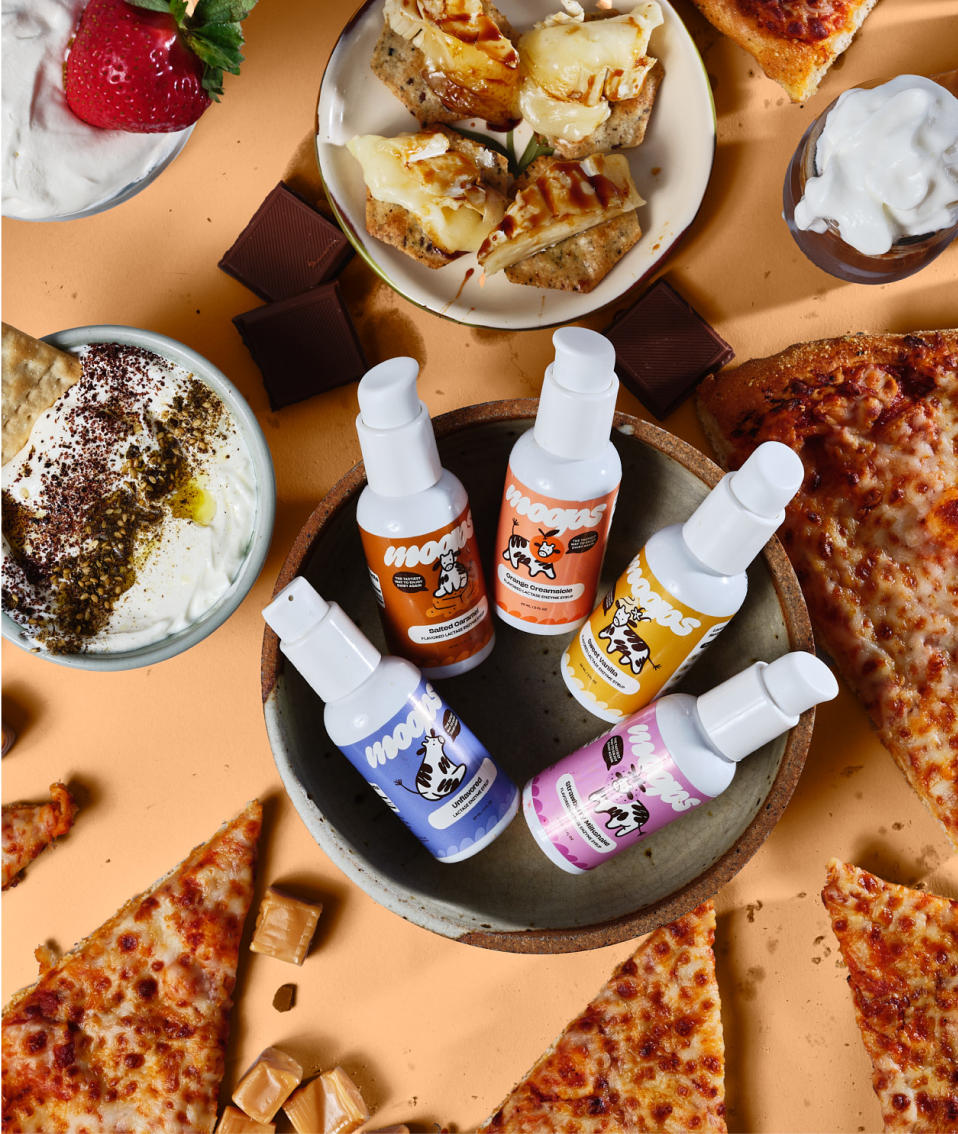
We created a full brand identity, homepage, and illustrative packaging designs for Moops’ new line of lactase enyzme syrup via our Branding Intensive, Packaging Intensive, and Design Day models.
Brand Design
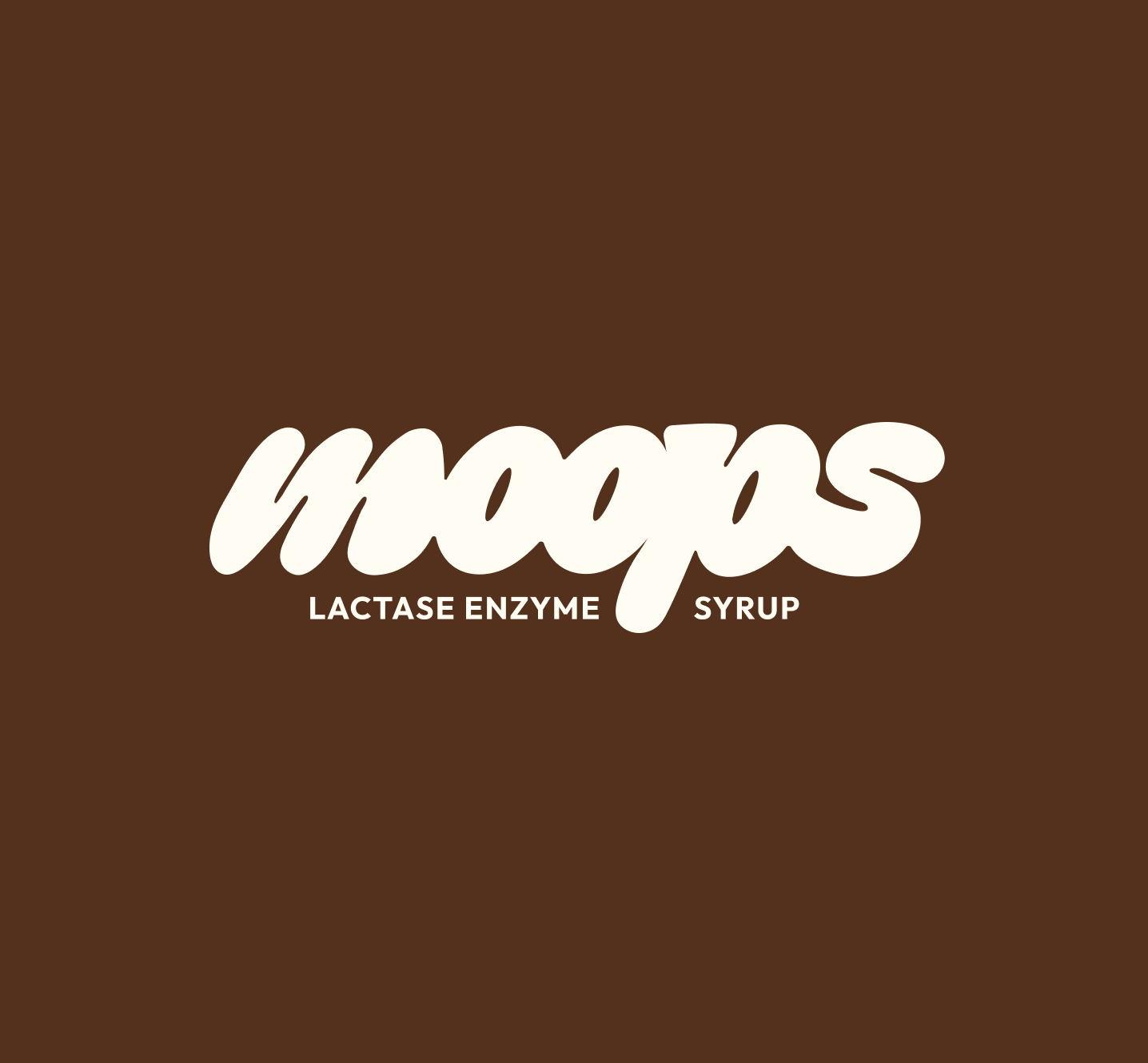
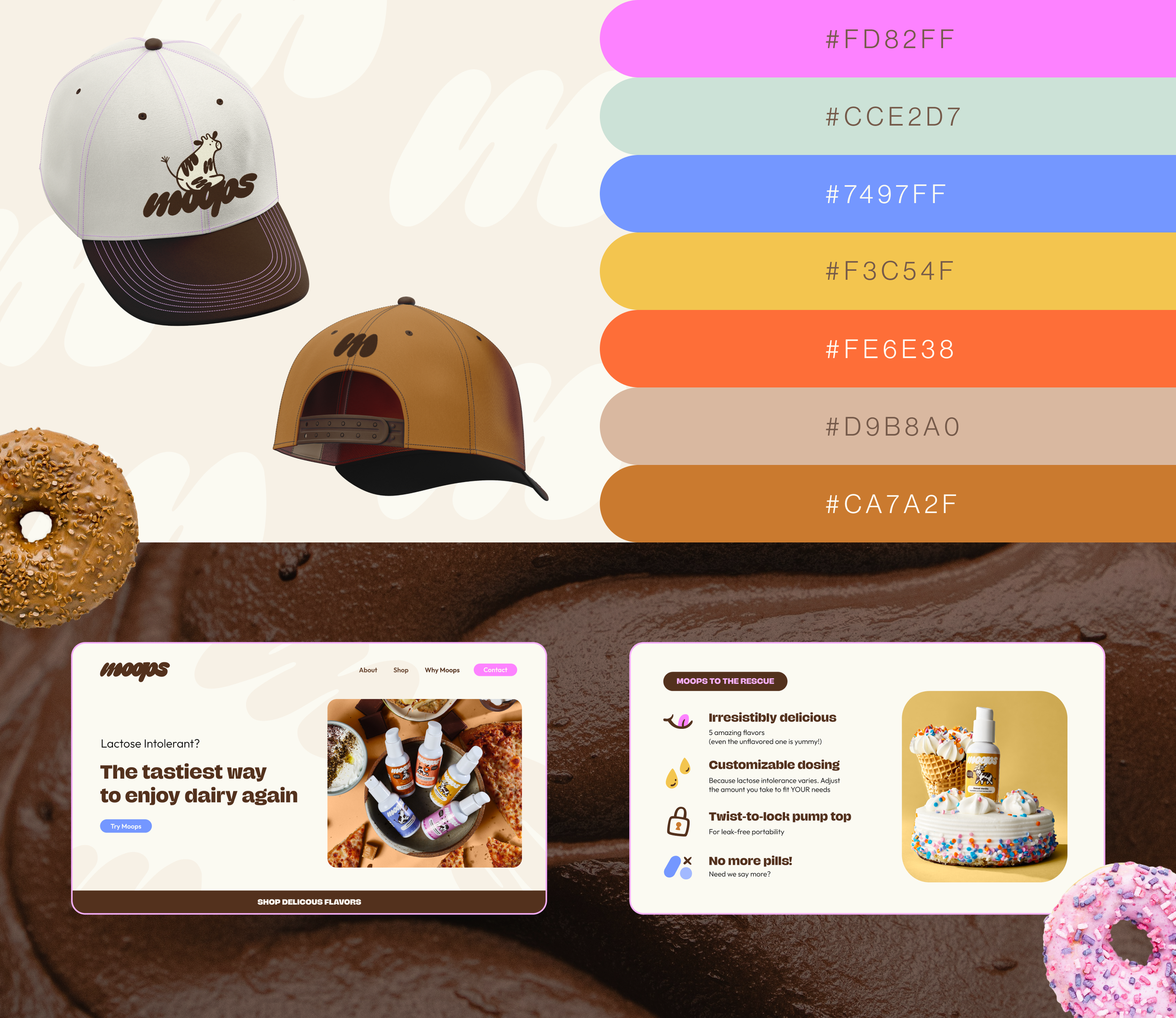
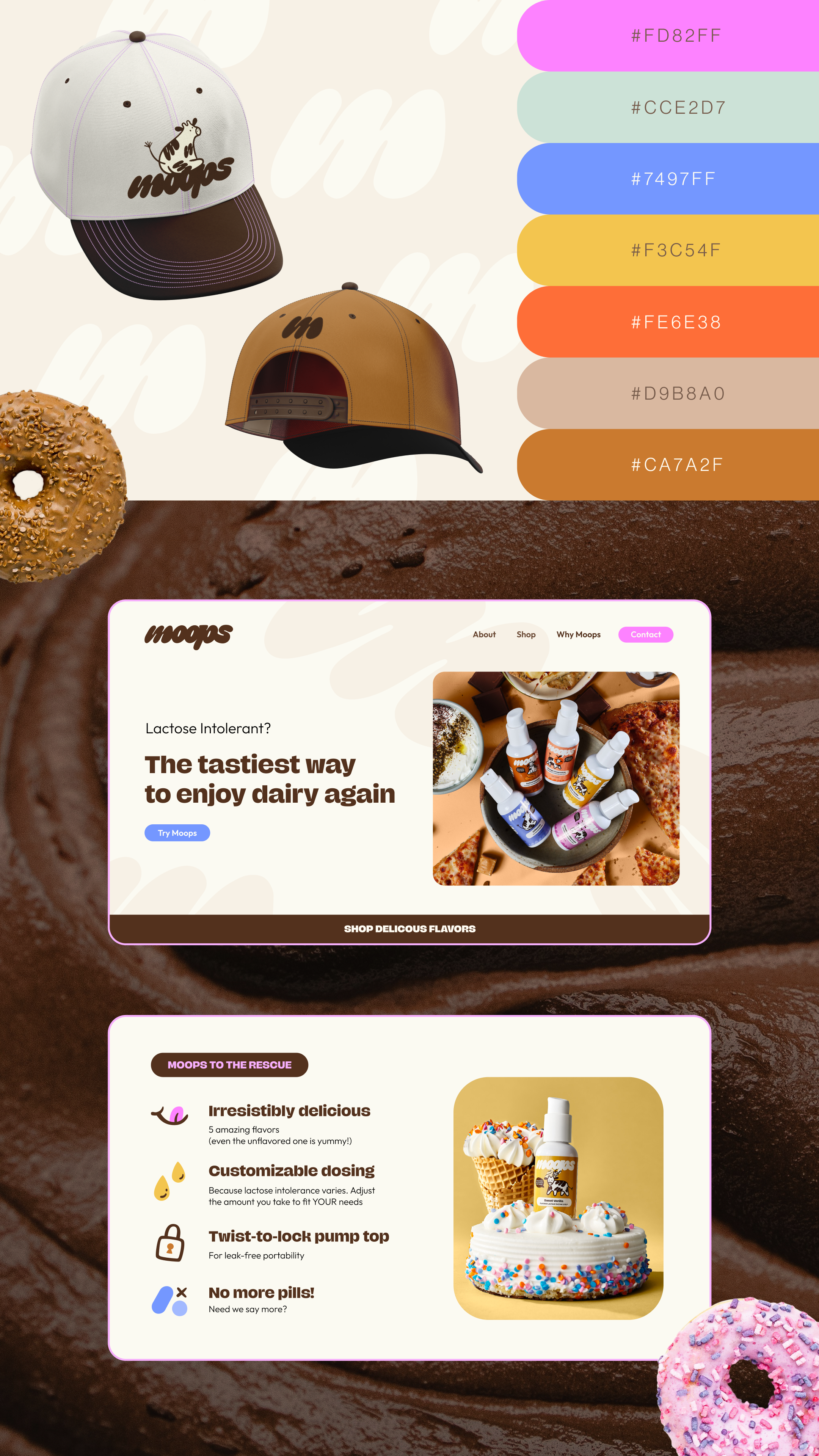
In order to match Moops’ playful and quirky brand voice, we created a custom hand drawn font for their logo system. The ultra thick letters that melt into each other are inspired by the gooey, creamy dairy users can now comfortably enjoy. The primary color palette is a limited cream and deep brown, allowing the individual color palettes for each flavor to shine.
Illustration
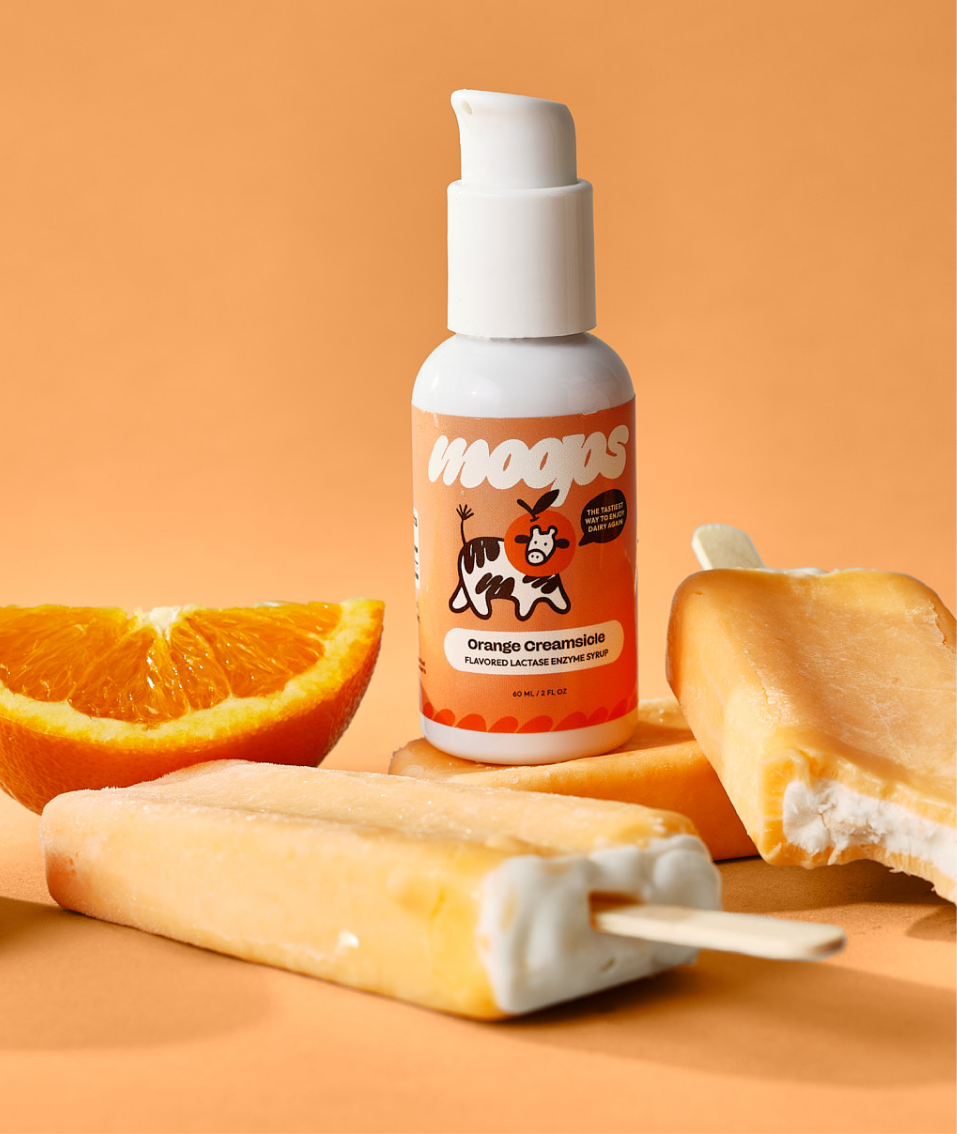
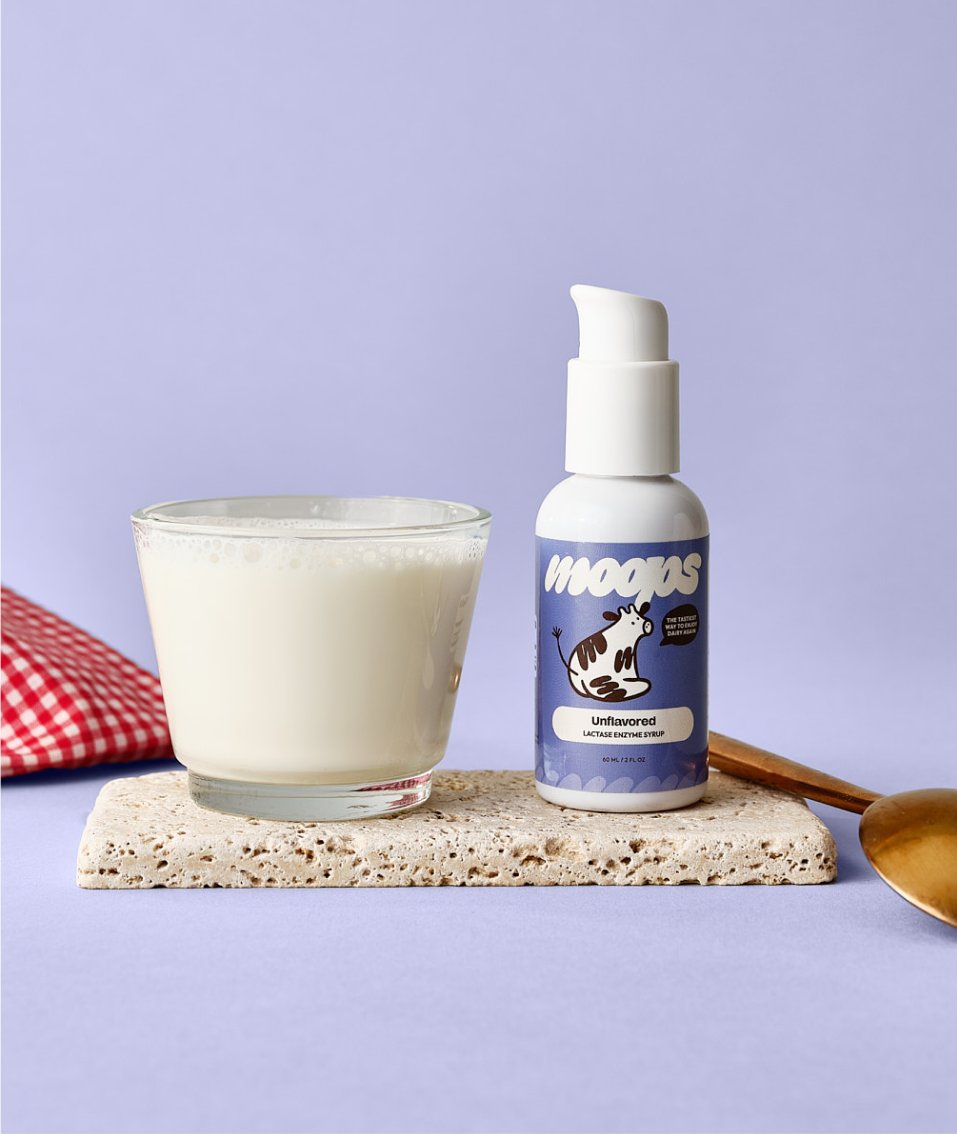
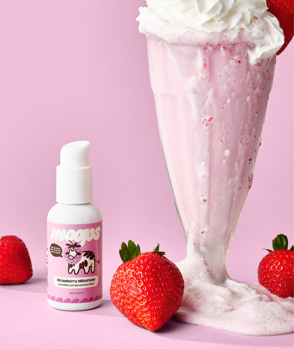
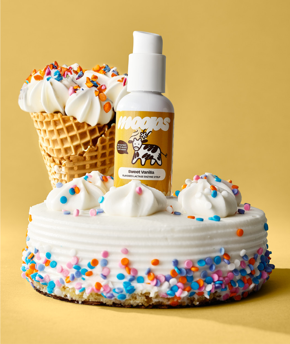
The name Moops obviously alluded to a cow as a branding element. Rather than working one into the logo system or leaning into the overdone cow print, we decided to go for a unique illustrative approach. Each product features a whimsical cow illustration, with “m” logo spots and a symbol of the syrup’s flavor.
Packaging
Our goal with packaging was to create a line of products that were eye-catching and cohesive as a set, while each individual bottle is a unique piece of art. In addition to each flavor featuring its own cow illustration, each label has its own bold color scheme within the overarching brand palette.
