Keats & Co
BRANDING, ILLUSTRATION & PACKAGING DESIGN
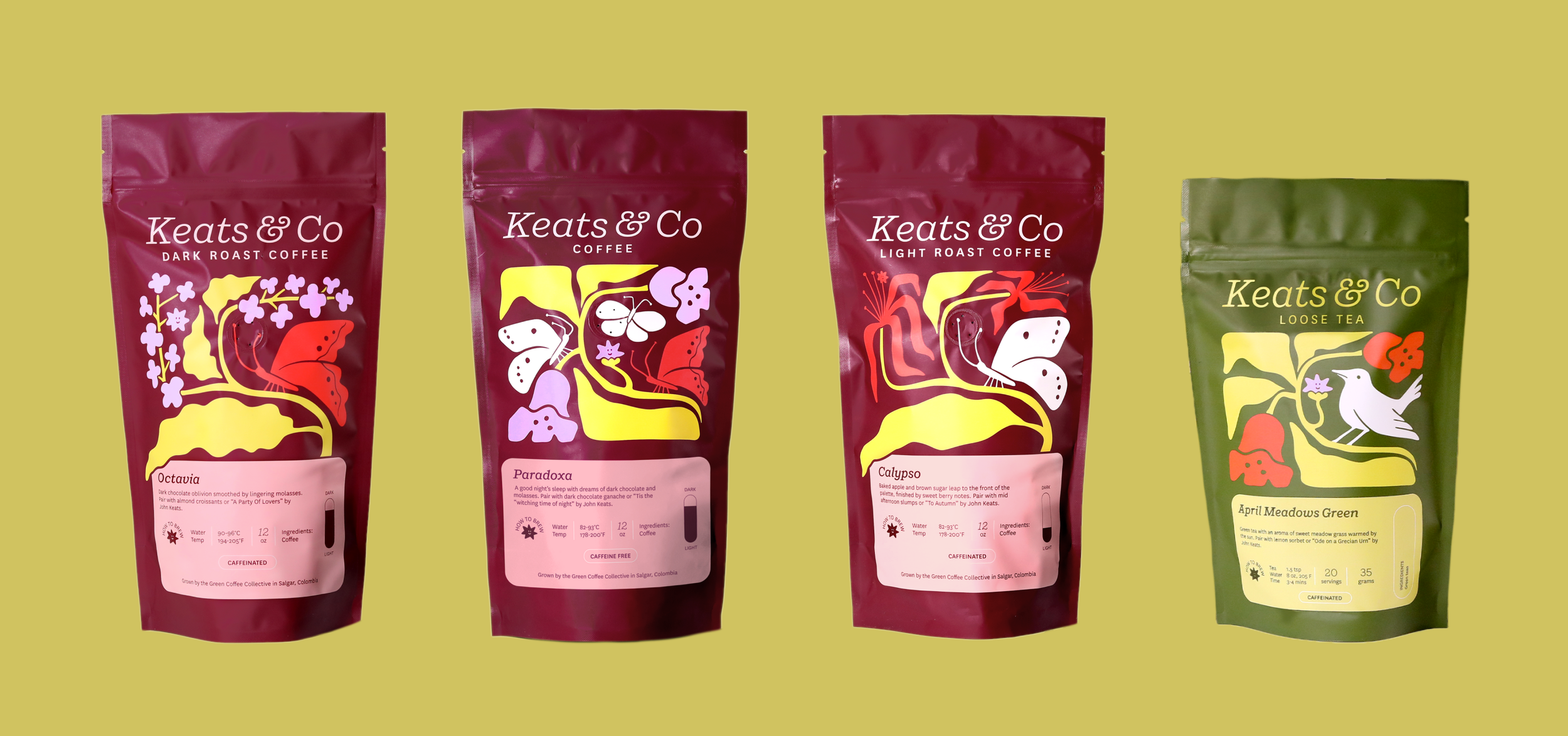
We created a brand identity and line of illustrative product designs for Keats & Co via our one week Intensive packages.
Following the rebrand of the nonprofit online shop Good.Store, we established the branding and packaging design for their new coffee and tea product line named Keats & Co. All of the proceeds from the Keats & Co line is donated to tuberculosis treatment.

Brand Design
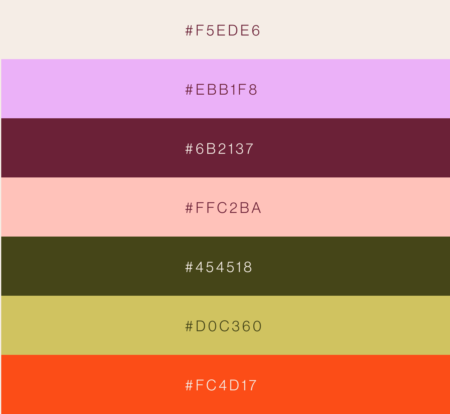
While Keats & Co is its own brand, it still needed to visually connect to the Good.Store umbrella. We started with a few colors from the Good.Store palette and expanded on them to create the Keats & Co palette, establishing a unique visual identity that coordinates with the primary brand. The brand fonts are inverted, using the vintage inspired serif for the primary logo.


Illustration
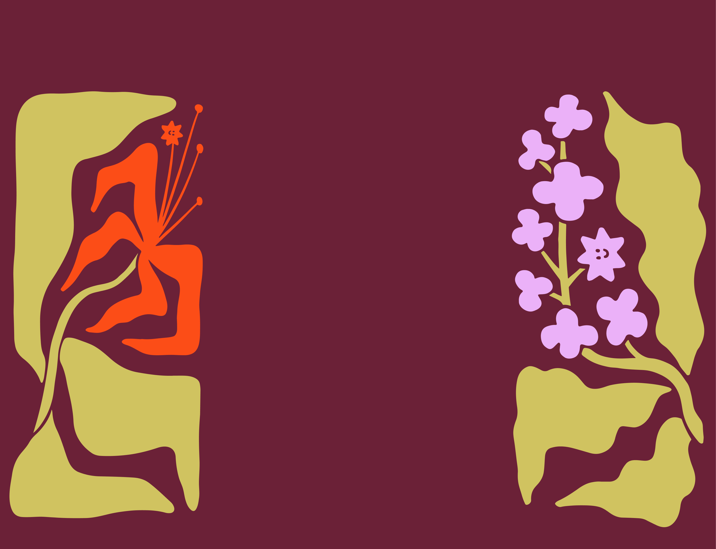
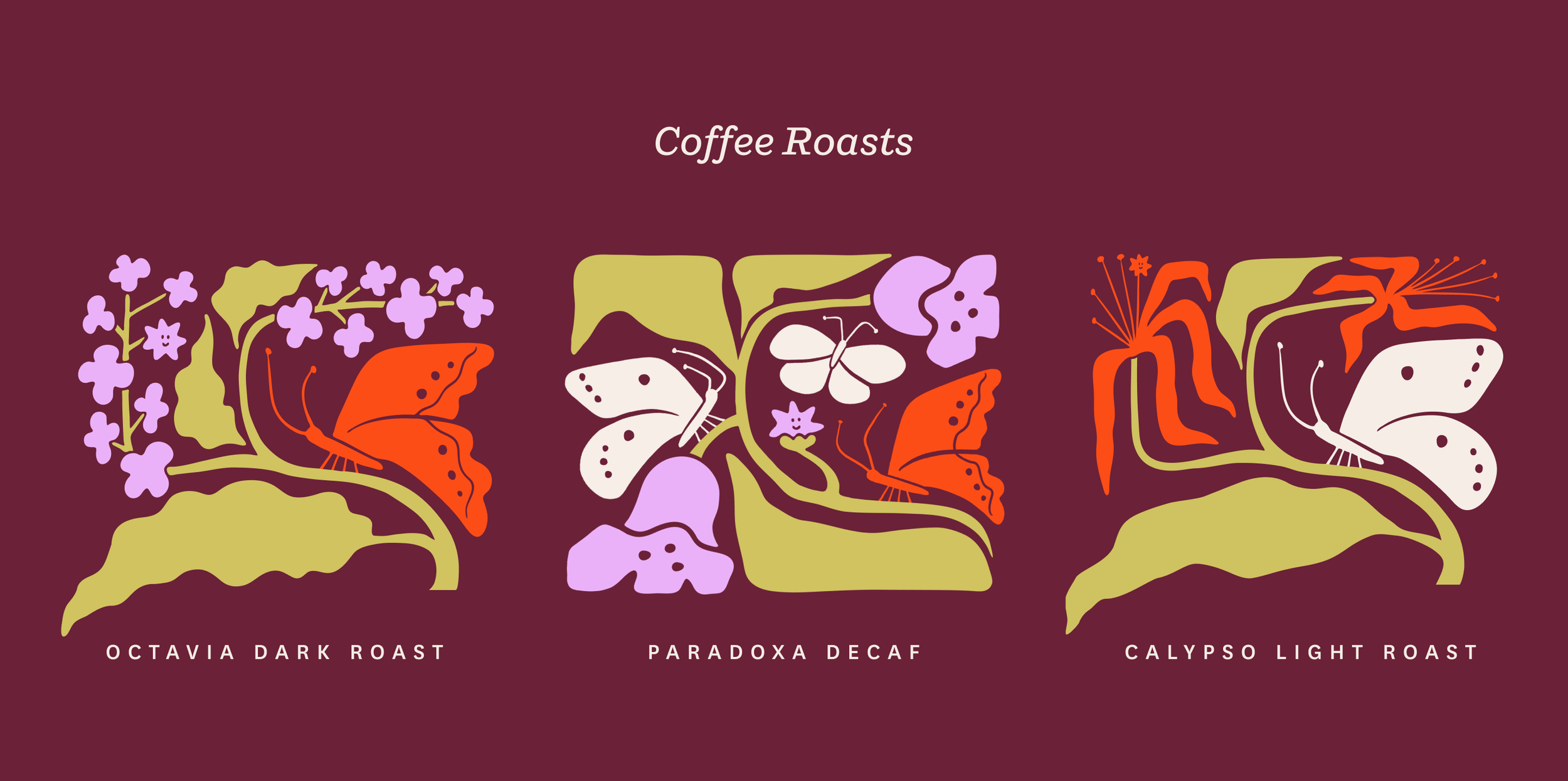
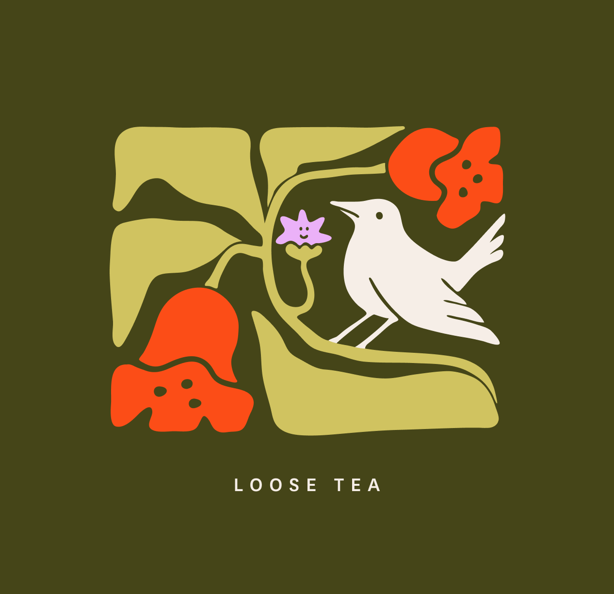
Illustration was another visual way we connected back to the primary brand, as Good.Store features a playful hand drawn character named Dot as its submark. We continued this very stylized, retro aesthetic into a unique set of illustrations for each coffee roast and tea. The brand illustrations are filled with symbolism and easter eggs, including a hidden Dot within each piece.
We were inspired by the brand's namesake and mission: influential poet John Keats, who died prematurely of tuberculosis, a preventable disease that Keats & Co donates all of their proceeds toward the treatment of. Each illustration includes flora and fauna that were featured in John Keats' poetry, used for tuberculosis treatment throughout history, or are native to the Sierra Leone region that Good.store conducts much of their charity.
Packaging
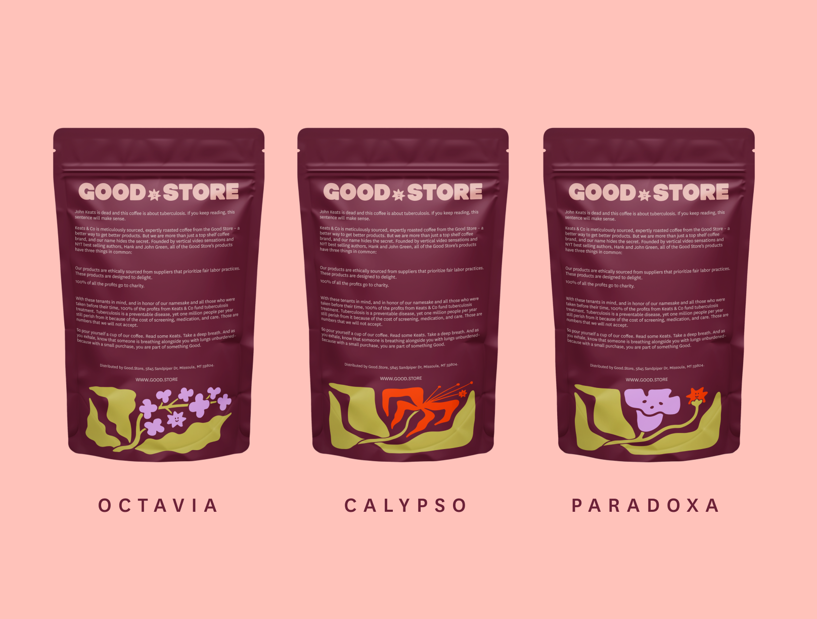
Tributary’s One Week Packaging Intensive service created designs for multiple component and product types, featuring an impressive set of 12 unique illustrations.
