Heraya
BRANDING DESIGN
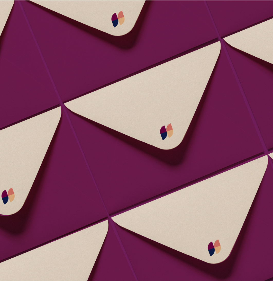
We created a full brand identity via our Branding Intensive service for Heraya, a company helping healthcare providers of chiropractic, acupuncture, massage, and naturopathic medicine grow with their network of health plans and employer groups.
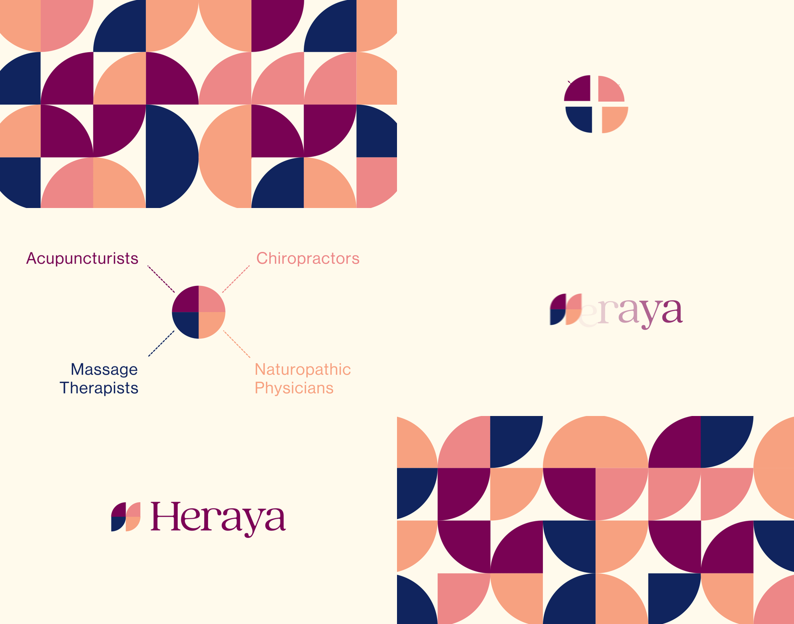

From the Tagalog greeting ‘Hiraya’ meaning:
”the fruit of one's hopes, dreams, and aspirations”
Wishing the recipient good health and prosperity. We wanted to choose a name that represented the bold, spirited energy that they are using to change the heathcare industry for the better.
In choosing a color palette for Heraya we wanted to represent the glow of warmth, a feeling of health and positivity. Rich purple is complimented by orange and peach tones contrasting with the navy blue which acts as a more traditional nod to healthcare branding.


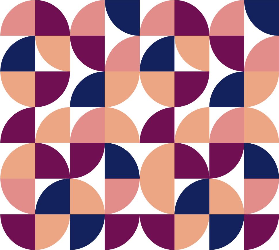
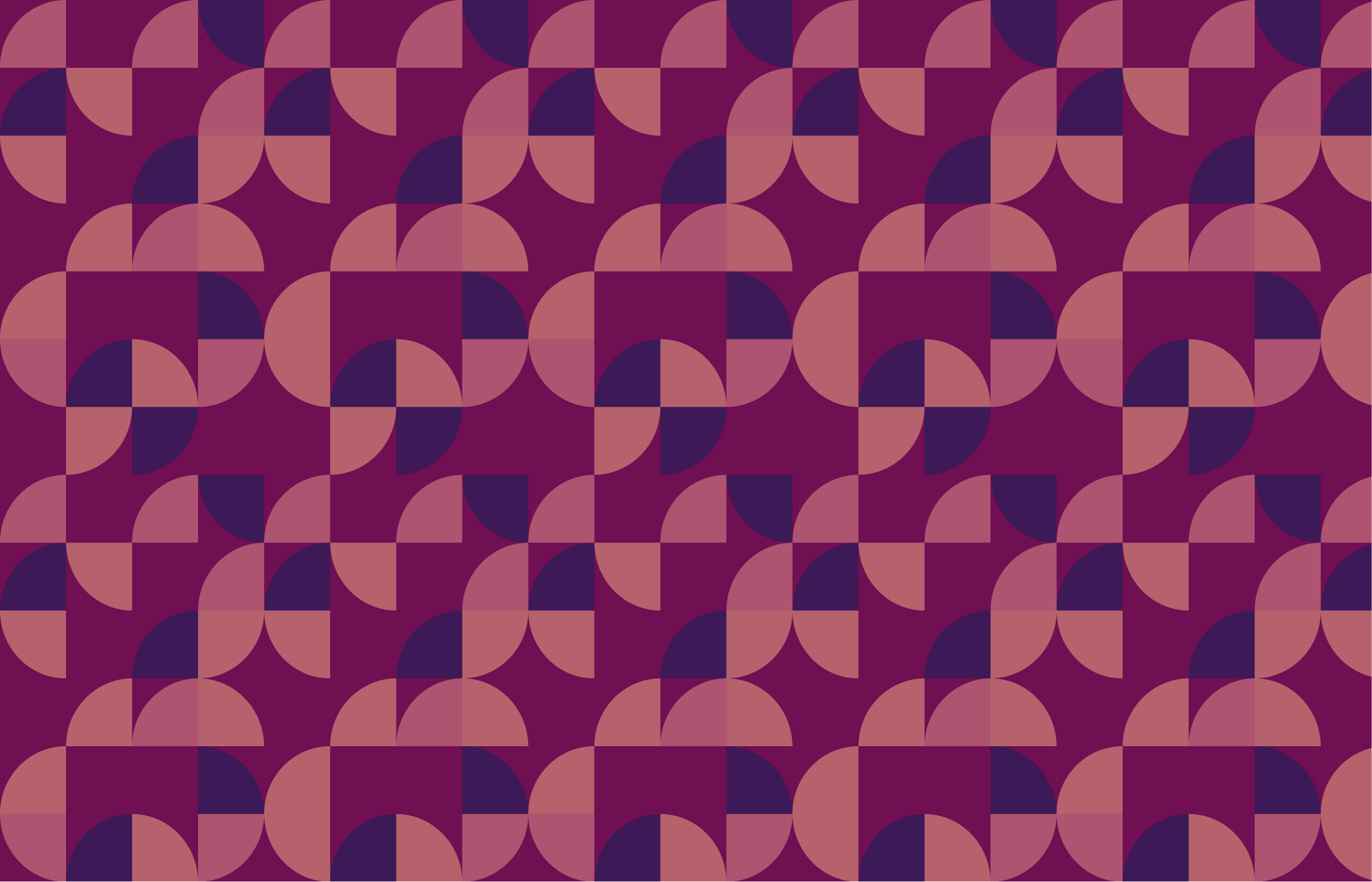
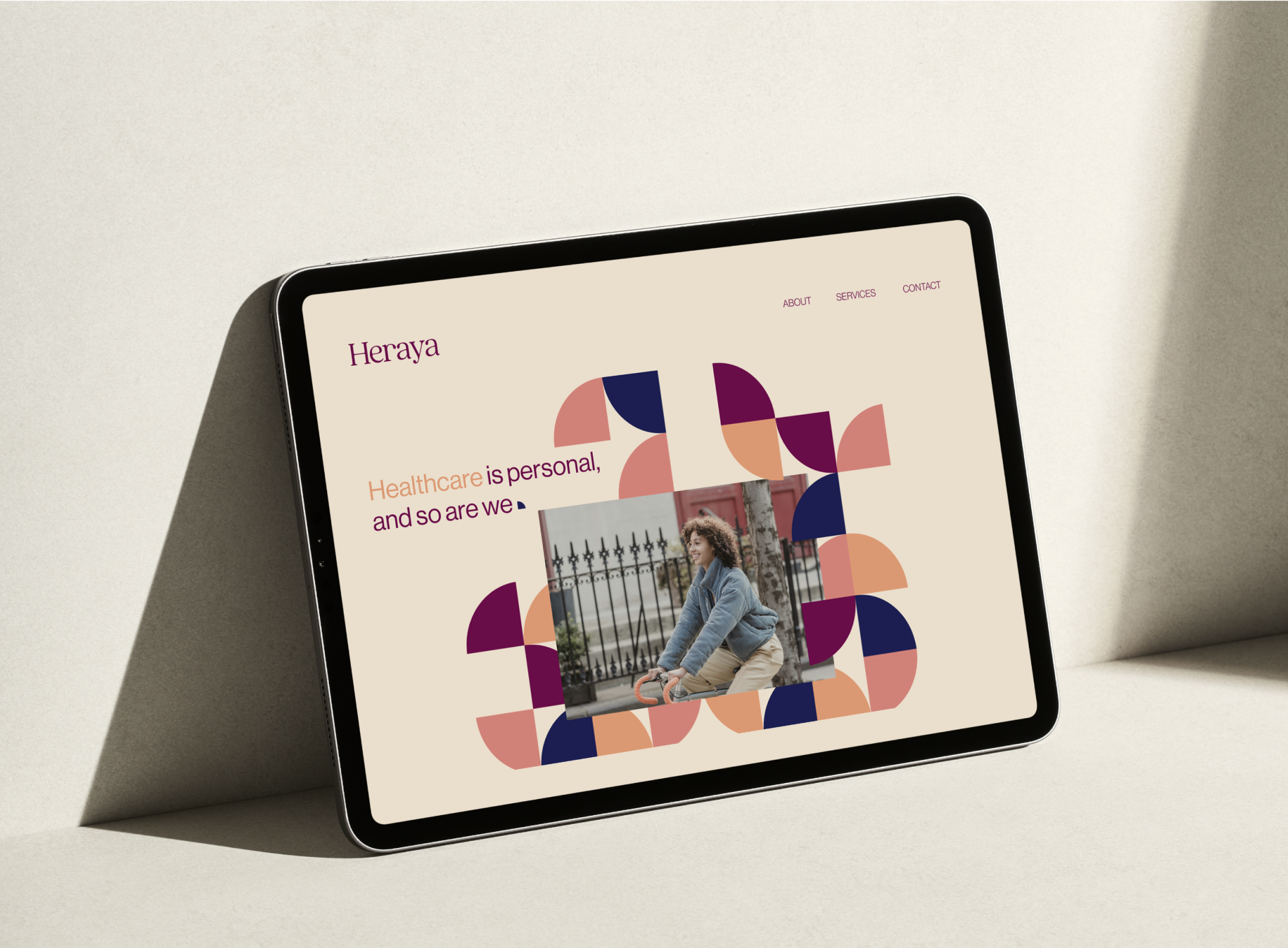
We created a versatile pattern for use digitally and across marketing collateral. The pattern has been created as a block which can be used as a whole or pulled a part to interact with images and text.
BRAND PHOTOGRAPHY
Heraya’s brand photography uses consistent imagery that’s both warm in tone and faded in texture. It shows members with their healthcare providers and leading healthy lives between appointments. A diverse range of members are represented to uphold the company’s mission to make integrative healthcare accessible for all.

